Thursday, 10 March 2016

Light Scars Using Moulds.

Products
  • Pre-made gelatine piece
  • Supracolour
  • Wound filler
  • Prosade
  • Translucent Powder
  • Witch Hazel
  • Cotton buds
  • Pro Clean remover.

Procedure
  • Cut the piece down so to remove any of the thick hard edges and excess gelatine.
  • Apply prosade to the area that the piece is going to be applied and also to the back of the piece.
  • Allow glue to go clear and tacky an apply piece making sure there is no air bubbles.
  • Blend the edges with a cotton bud dipped in witch hazel.
  • Powder the gelatine.
  • Colour the piece, mixing colour with alcohol or moisturiser to thin it down.
  • Remove with pro clean.
Health and Safety
  • Make sure the model is comfortable with having gelatine used on them.
  • Use in an open space.
  • Make sure the model does a patch test for prosade.
Evaluation

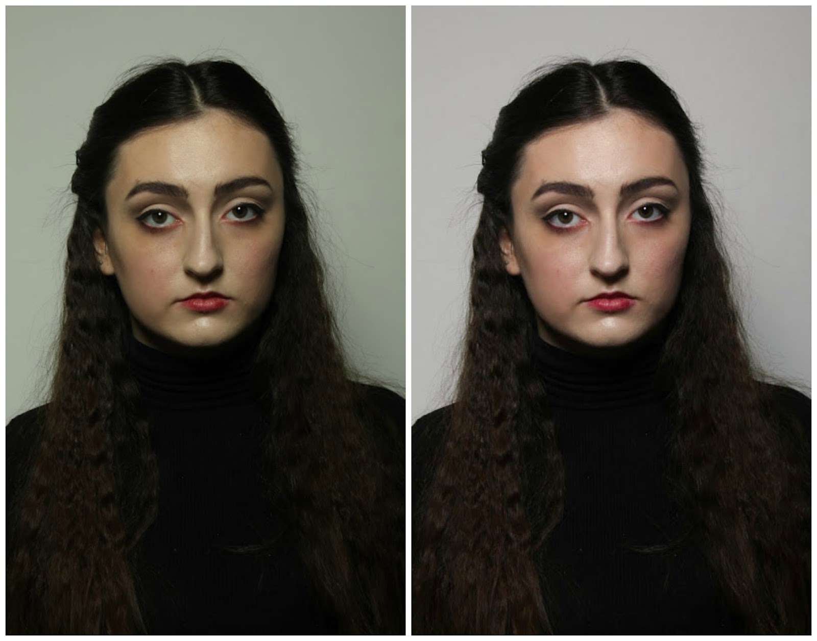
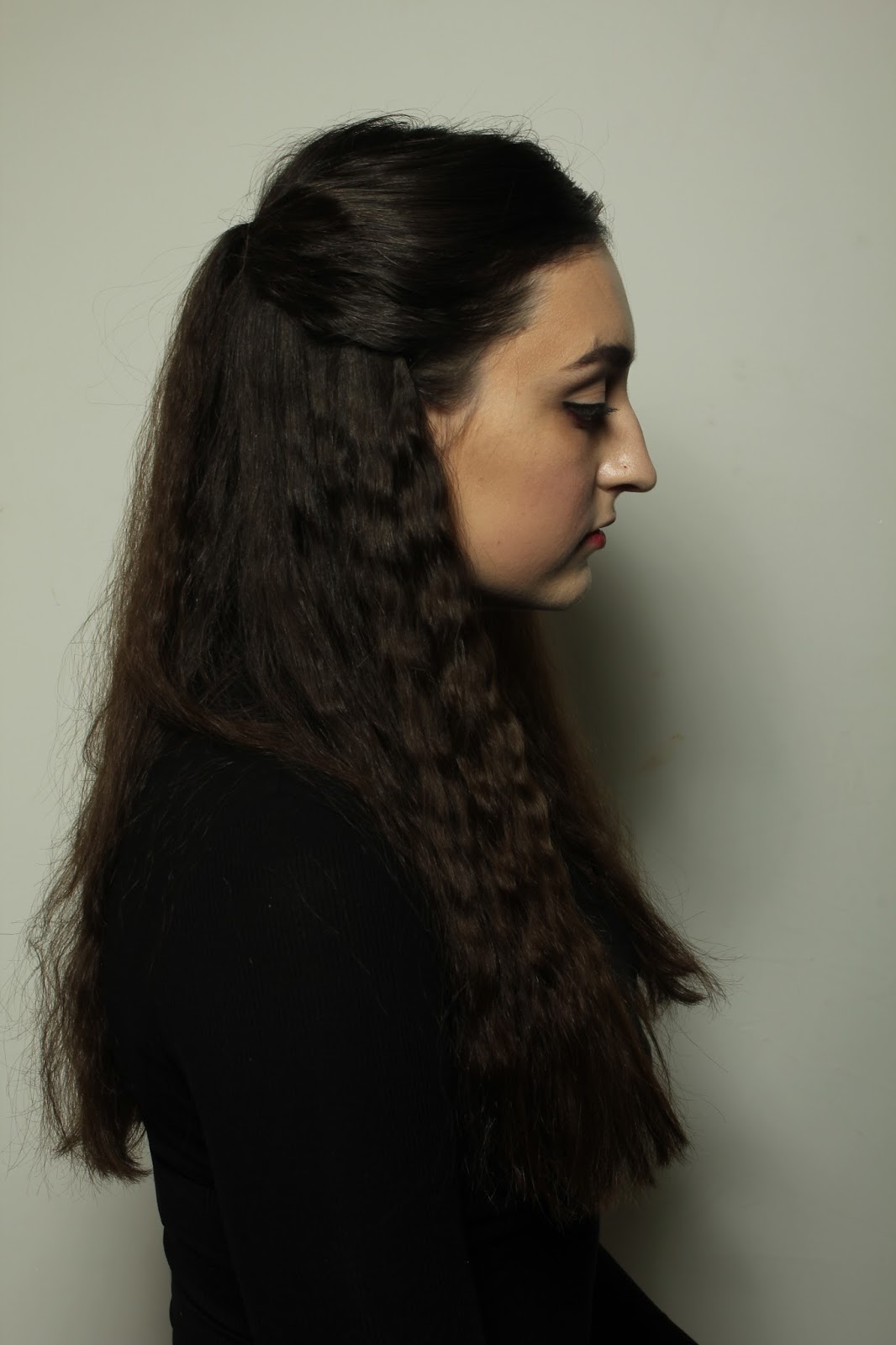
These two images show the gelatine piece applied and also after it had been took off. I am really disappointed with how this went because I believe it could have looked a lot better, I only managed to blend away one side as the others were too thick and I also think my colouring is poor, as when I was applying the colour it was sliding straight off the gelatine. To improve this in the future I think I would have tried melting down the edges of the gelatine to make it thinner before applying it to the model then blend it with witch hazel. 


Horror in Fashion - Alexander McQueen A/W 2009

As an introduction to the new unit we played about in class creating makeups from runway shows that were inspired by horror. I chose to try and create a look from Alexander McQueens A/W 2009 show this was his controversial Horn of Plenty collection, which included a set littered with stylized trash and fabrics that were meant to look like garbage bags, the models had white washed faces, exaggerated lacquered lips and headpieces made from all sorts of trash.
These images are my recreation of of the look above, I chose this design because I thought that creating the perfect circle would be really challenging to do. I created this look by applying a light coverage of a foundation that was a few shades lighter than my models skin tone and contoured with a shade that was slightly darker, lightly applied some shadow to the crease reaching up towards the temples, and blocked the brows with foundation. Doing the lip line was even more challenging than I thought it would be, and my application ended up being slightly wonky and not as circular as I wanted it to be, I also think it would benefit from being extended more at the sides of the mouth, my design looks to pouty. I really enjoyed doing this look and think if I recreated it I would either use a stencil or draw an outline with a white pencil to get a precise shape.

Changing the White Balance on Continuity Images

The main thing that I feel I need to change for my continuity images is the white balance on the images, I feel like the makeup in both of my assessments is pretty similar, but because the lighting is off it is hard to tell if I have actually kept the continuity for my assessment as all the tones are off.

I did this by opening up the images on Photoshop, applying a camera raw filter and changing the white balance with the dropper tool, I clicked on the whitest part of the images to try and get a true reading of what the white balance on the images should look like.

The images on the left are the original and on the right are the ones with the white balance changed, the lighting is still not identical but is much netter than the initial photos.


I have only changed the white balance on the three images that I will be Including on my PDF, It was such a struggle to try and get the the images as close as I wanted them to be, I feel that on the second day the skin tone was a lot warmer, and It is really hard to tell if this is because of the lighting or because of the makeup application.

I can still tell that the white balance is off between these two images, but this is as close as I could have got the images without completely altering the image.


Side by Side Comparison & Evaluation

Front (A & B)


Sides (A & B)
 Back (A & B)

These are my front, back and side shots from my continuity assessments. As you can see from the images I have had a slight problem with the white balance of the camera, all the images from the first assessment are very light in comparison to those from the second assessment, these are really dark and warm which has made the reds in the image look really vivid, I don't think that this translates to how my make-up looked in real life, so I want to have a play around with the white balance on bridge to try and get a more accurate reading of the colour, but I will do this in another post. I am really pleased at how well I kept the continuity in the images, I feel that they look really similar and that I have got the tones correct, however I think in the second assessment the contour and the red on the lips and cheeks looks slightly darker than in the first image, the skin tone also looks a lot warmer, but I do think this is down to the white balance of the camera. The area that I feel lacks continuity is the hair, in the first image the centre parting bends off to the right and the second to the left, this is something I could have avoided if I was a little bit more careful, and as you can see in the back facing images, the hair is a lot more textured from the second assessment, this was because I used different hair straighteners and my sections were probably off too, changing my tools is something I shouldn't have done and I will keep this in mind for the future. Overall, I am very happy with the makeup, I think I kept the continuity really well, and that is is suitable for HD, but I think my hair lets me down a lot and I need to pay a lot more attention to this aspect of my design in the future.

Wednesday, 9 March 2016

Breif 1 Evaluation

Overall I don't think I have really identified with this brief as much as I could have, the aspects of this brief that I did enjoy was reading the novel and building characters through evaluation of quotes, however I do feel very restricted when working to a brief that has to be accurate to a period, this really narrowed down what I could do for this design and I found it hard to get motivated and inspired when creating my character, I was really pleased when choosing my novel as I could get away with not using special effects to create this character, as this is something that I do not enjoy doing. However I have learnt some techniques that I think will be invaluable for me I really enjoyed the hair in this unit, as it helped me create elaborate hairstyles that I never thought I was capable of creating. I found the continuity aspect of this unit really challenging, but it showed me how much I can improve from repeating a design, most of the techniques I was using were becoming pretty much second nature to me.

I am really, really excited to start the new brief because I feel like I will be able to get a lot more artistic freedom when creating this. It is also a lot more relevant to what I would like to be doing in the future.

Continuity Assessment 2 Images


Continuity Assessment 2 Evaluation

My second continuity assessment went as smoothly as the first time, I found it really easy to re create the look as I knew the design really well, I found it took me much less time to finish the design, and I was cleared up and packed away before the end of the assessment, this was a really good learning curve for me because it shows that the more familiar I become with applying the makeup the quicker I will get at applying it.

When doing my second assessment I stuck my face chart, hair design and continuity notes to the mirror and also 4 images showing the front, back and side views of my character, this really helped having a visual reference to look at when re applying the makeup.

Overall I think I did a good job keeping continuity for my makeup, when applying it I found things coming back to me like which brush to use and also what quantities I had to mix together to create the desired look, but it was really helpful to be able to refer back to notes to make sure it was as close as possible. I think I did a really good job keeping the colours the right shades and also the same vibrancies, this was the part I was worried about as I was mixing the colours with moisturiser to thin them down, so it could have been easy to botch up the ratios. When doing this design I think my hair was the part that would have given the continuity away the most, this could have been because of external factors as during the assessments I used different brands of hair straighteners, and during the second assessment the hair straighteners were definitely better and I got a deeper wave to the hair, this is something I should have took into consideration when applying my design. I think the main aspect of my design that let me down was definitely the hair, I think I should have done something more elaborate, and also because I couldn't hide the pins I feel like it looks sloppy and I am really unhappy with this.