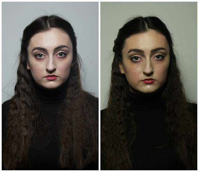
Front (A & B)
Sides (A & B)
Back (A & B)
These are my front, back and side shots from my continuity assessments. As you can see from the images I have had a slight problem with the white balance of the camera, all the images from the first assessment are very light in comparison to those from the second assessment, these are really dark and warm which has made the reds in the image look really vivid, I don't think that this translates to how my make-up looked in real life, so I want to have a play around with the white balance on bridge to try and get a more accurate reading of the colour, but I will do this in another post. I am really pleased at how well I kept the continuity in the images, I feel that they look really similar and that I have got the tones correct, however I think in the second assessment the contour and the red on the lips and cheeks looks slightly darker than in the first image, the skin tone also looks a lot warmer, but I do think this is down to the white balance of the camera. The area that I feel lacks continuity is the hair, in the first image the centre parting bends off to the right and the second to the left, this is something I could have avoided if I was a little bit more careful, and as you can see in the back facing images, the hair is a lot more textured from the second assessment, this was because I used different hair straighteners and my sections were probably off too, changing my tools is something I shouldn't have done and I will keep this in mind for the future. Overall, I am very happy with the makeup, I think I kept the continuity really well, and that is is suitable for HD, but I think my hair lets me down a lot and I need to pay a lot more attention to this aspect of my design in the future.


No comments:
Post a Comment